Man Need Fire - A postmortem Pt.1

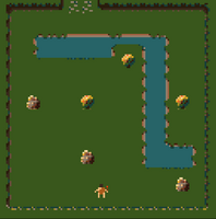



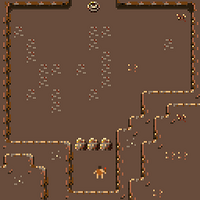
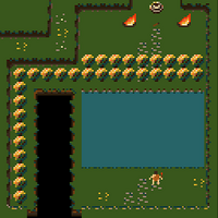
Creating Man Need Fire was an interesting experience in many ways. This was actually my very first time participating in Ludum Dare, where the majority of my game jam experience was with Global Game Jam, which was usually done with a team, but now I had the chance to do things on my own. I learned to make some music, which was something that I had always wanted to do. I was also able to flex some of my level design skills and to learn some good project planning skills. As a programmer by trade, I don’t usually get the opportunity to be fully involved in the creative sides as well as project planning, so I was super excited to be able to apply some theory to my work. I wanted to discuss a bit about the project now that I’ve had some time to reflect, and have come down from the high of the jam.
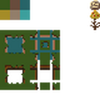
So let's talk about some of the restrictions that I wanted for myself right off the bat. I wanted a very simple palette of colors to work with, because it would force me to become creative in how I applied the colors. My other self-imposed restriction was to use 8px square tile for everything.
The Good
Things went really well with the character design, I had an idea in my head of approximately what i wanted the character to look like, drawing inspiration from some more abstract designs

as I've always found this to be very appealing. Obviously the character didn’t end looking like that, but this generally simplicity was what i was targeting. The character that is in the game now, was actually the first thing that I had drawn out, and I really liked it, but didn’t want to go with the very first thing I drew. I created 2 more concepts for the character (which looked bad enough that i honestly didn’t even bother saving them) before finally just caving and returning to that original concept. I didn’t have my final palette at this point, so the color scheme was definitely still in the air, but I was happy enough to move on.
I was able to find a fantastic website for pixel art palettes(which upon my research after the fact found out multiple people actually recommend it for exactly what i had used it for) . So originally i would’ve tried to tackle a palette on my own, and I would be lying if i said that i had a perfect understanding of colour theory, but after watching the GDC postmortem give by Adam Robinson-Yu about his game A Short Hike, Adam talks about his palette selection (
) and what he used for the game, and I wondered why i never came to the same conclusion as it seemed so obvious. So I went on the search for what I wanted the game to look like, and settled on .
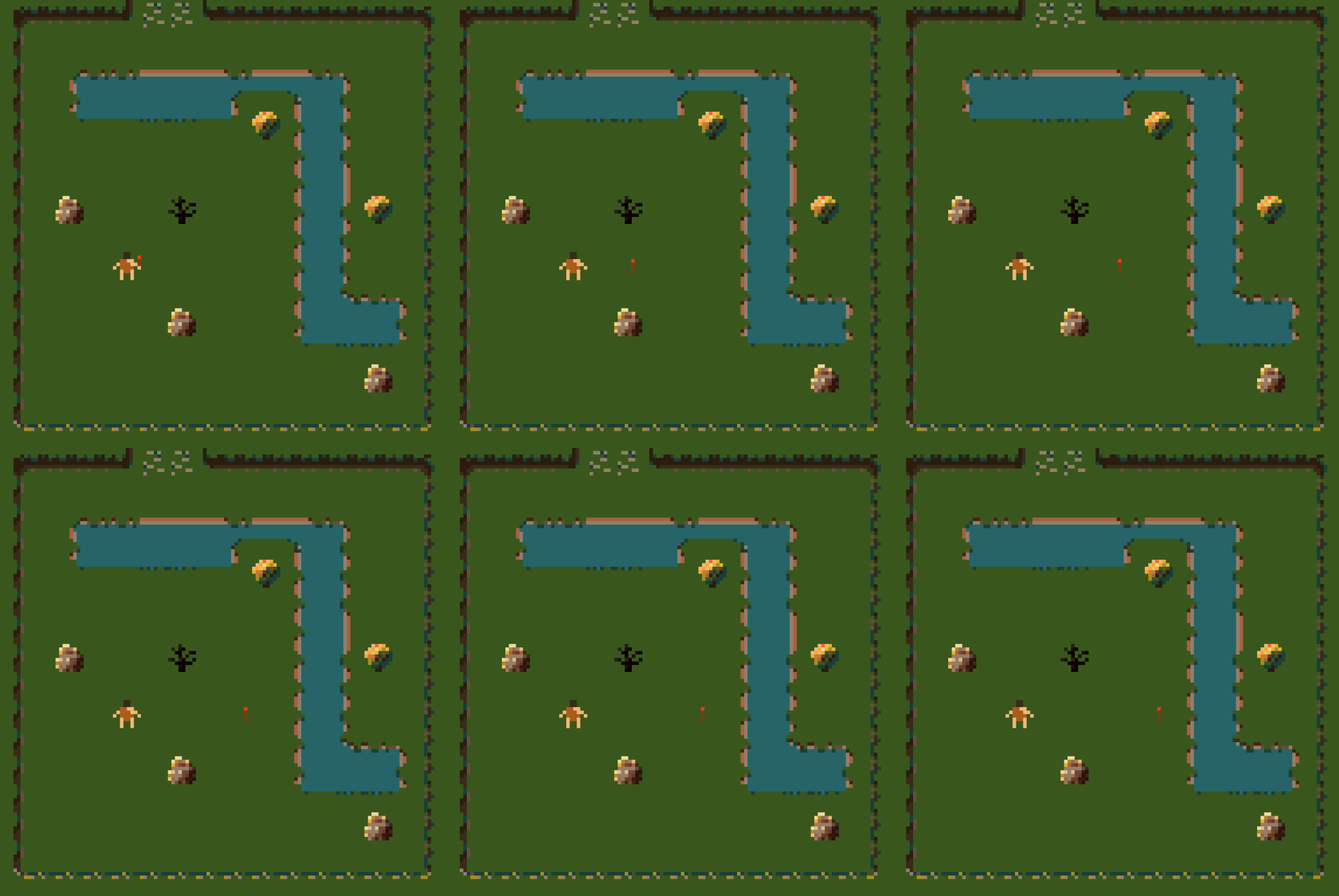
It offered a wide range of color options, which i thought would be very easy, but making good use of the colors actually was quite challenging to be able to showcase some of the depth and lighting on the objects in the game. I would use colors that I wouldn't have ever thought to apply, and they ended up working in my favor, giving a lot of personality to the environment. To start out and pick the colors that i wanted to use for the environment, I pick a set of 10 colors that i thought would work well, and walked the character around to see what worked well and what didn’t, settling on six main colors I wanted for the environment, which were the base colors and highlights for: Grass, Dirt and water. We can see in the images how I went from bare bones, to way more fleshed out. Notice how simple the boulder and bush were at that time, and how the highlights really just make them pop.


The music was a ton of fun. This was my first time doing any music work, but it's always something that I had my heart set on. I browsed the tools recommended for Ludum Dare, and downloaded all of the music ones. I wanted to get a feel for which might be more what I was looking for, for both my skill level, and understanding of what the heck i was doing. There were lots of great options, but I settled on Bosca Ceoil and oh boy was that a good decision. I’ll be honest, starting out to figure out what the heck was going on was tough in terms of controls, and layout, but once i was over that learning curve it was smooth sailing. I would describe myself as a music lover, so i was ready to apply my ear to the task. I experimented with so many different instruments within the application, and wanted to find the feel that complimented the game. I knew in my head what I was looking for, but needed to play around a lot to get to where I wanted to be. I knew some simple setups for music from my days of listening to drum and bass, where I heard a song describing what pieces to add, and how it changed the sound (I cannot find the song, though this really only applied to percussion in the end). I was able to settle on 2 instruments that gave the more tribal feel I was looking for, and had a great sound, The Marimba, and the sitar. Both sounded great, of course i had to play around with the sequences, but i found patterns that I thought worked well together, and in a way that would loop effortlessly. I created the Jungle song first, which was actually my favourite because it's so simple, and yet sounds great. I feel I stumbled more so on the later songs, as if I were trying too hard, and was no longer in the flow of creating the songs, which you can see in the Desert song. The menu song was actually one that turned out pretty well, as it set up a feel or expectation for the game that just complimented the visuals so well, while still trying to communicate the seriousness of the players early predicament. Finally the home song was created. I didn’t originally plan to have that but as I was creating that final level, I didn’t want to have that conflict song, I wanted something light and cheery that communicated to the player that they were now at peace, or all is well in the world.
The level progression setup was also something that I knew I wanted to pursue early on. I had grandiose dreams of all of the mechanics and fun things that i could add, but they weren’t all able to be included. I will review those things in part 2. When i was creating the levels they were all scattered, as i was just vomiting ideas into life in no particular order. There were mechanics that I wanted to include, such as catching the bushes on fire, needing to throw your torch, and moving boulders, and everything was based on those main ideas. As I would do the play-testing though, i found that some levels made more sense if they appeared before another, then I began to remember some of the things i learned from watching Johnathan Blow, and GDC talks (Which specifically i cannot recall) about only introducing mechanics one at a time, and allowing the player to become comfortable with what we are showing them.
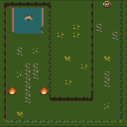
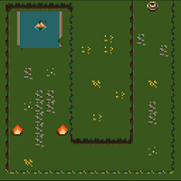
So for example, I needed to show the player that their torch would extinguish the torch without penalizing the player, one of the levels begins with the player falling into water, where they would then need to move to a fire pit to re-light the torch before they can move onto the next level. This also presented an opportunity for me to be able to have a more interactive menu, where all the basic mechanics can be found in the menu, as well as the simple instruction of which controls players can use, and what the objective is. To even exit the menu, the player must pick up the torch, light it on fire, and bring the lit torch to the waypoint, which is the entire game, so that presented itself as a great way to teach the player. Another way I was able to teach the player about a new mechanic, is for the boulders.
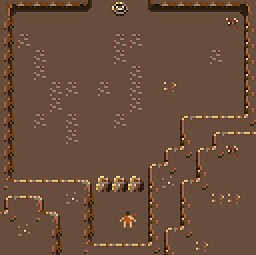
The first desert level, the player is dropped in and gives no other option than to move towards the boulder, upon which the player would see that move, and instilling in the mind of the player that these boulders can and should be moved. The very next level, which is very simple, solidifies in the players mind how to push the boulders, as they need to move many to get to the end of the level. It felt like a great overall execution of designing the levels. Once i got to a point where i knew that i wouldn't be able to include all of the mechanics i wanted, i wanted to blitz as many levels as I could. Loading the levels was a surprising dilemma, as i wanted to load each one based off of a specific ID, where i would set the Id to load as part of the component. This was fine when there were only a few levels, but adding more and testing soon became a big pain in my butt, not to mention how I was going to handle restarting levels. I settled on a basic incremental system, where the order in the hierarchy off the scene would actually dictate the load order, which made it incredibly easy for me to move levels around after they were made. Loading levels also turned into an interesting solution, as I instantiated the levels from a prefab that existed within the scene disabled. I wouldn’t normally do this in a project, as I feel it's very abrasive, but it worked well for the time restrictions. I would keep track of the current level as an index, and instantiate that game object, enabling it, and moving the player to the set start location, all within the same load function. One of the other important things i wanted to include as I was nearing the end, was a conclusions, leaving the player hanging wasn’t something that sat well with me so, adding a new end level and moving it to the last level in the list, meant that no matter how many more levels I added (placed above the final level), there would always be a conclusion. This saved me so much stress, this is definitely a technique I will continue to apply.
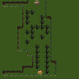
The final important piece was to do with play testing. In most cases I end up doing the majority of the testing with my games, mostly because I think that others will not understand what I am doing, or am too self-conscious. Having seen so many tips and recommendations though stating that I need to be testing early and testing often, I thought that this was a perfect opportunity to put this to the test. Oh boy did I realise what great feedback I was missing. I was able to understand which parts of the levels were confusing, or what bugs may exist. For example, in the burnt bush level, which is the first time the player interacts with the burnt bush, it was originally appearing after the first bush burn level, I had my significant other play through the game, where they specifically avoided the bushes where I intended to teach them that they should go through them. This was super important to be able to progress in some of the later levels, so i decided to use the same idea that i did with the level where the player falls into the pool, but having the player spawn on top of the burnt bush to not only force them to break the first few, but then has them walk forward breaking many more bushes before exiting the level. Though my SO is not a gamer, or a game developer, watching them play, to see where they stumble or become confused was invaluable to ensuring that my level design and progression was clear and straightforward.
In my next part I will cover some of the topics that I thought went wrong in the development, things that I would change for next time. Stay tuned. I also would certainly appreciate any feedback on Man Need Fire or this post.

Leave a comment
Log in with itch.io to leave a comment.